Southwest is the airline you pick when price is the point.
Low fares, no change fees, two bags free. It's built its whole reputation on being the affordable, no-frills choice, and it's one of the largest domestic carriers in the country.
And the website is where that promise gets kept or broken. Booking, check-in, managing trips, flight status — it all runs through one site.
So we didn't start with a redesign. We started with a question:
If people come to Southwest for price, can they actually find the cheapest flight?
Before changing a single thing, we set out to evaluate the booking experience exactly as it was.
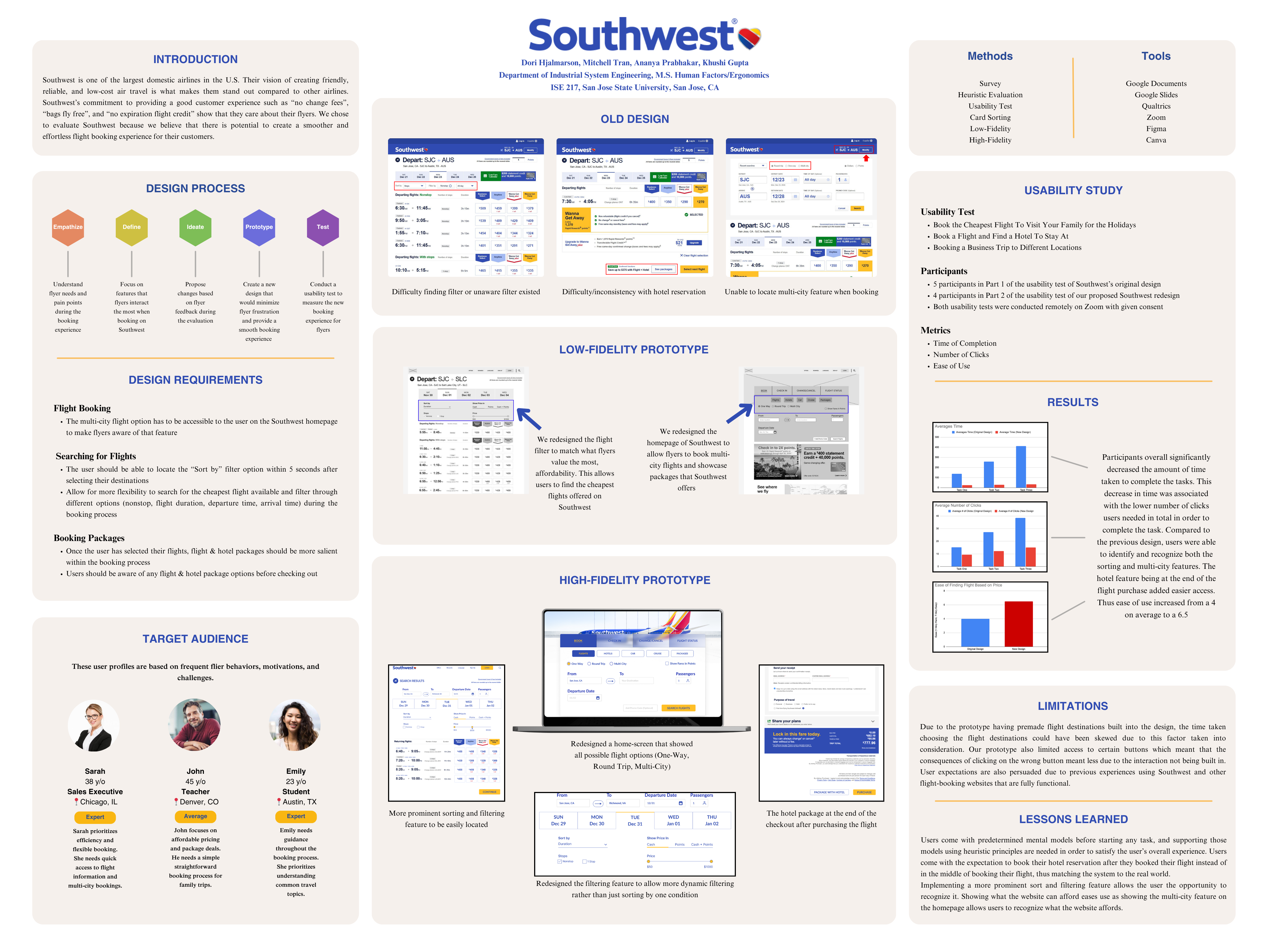
Before redesigning anything, we needed to know two things: what flyers actually care about, and where the current site lets them down.
First, we asked.
A survey, 20 questions, 21 responses. Two numbers set the agenda for everything after:
Over half of respondents had flown Southwest before, so this wasn't outsiders guessing. These were the people the site is built for.
Then we figured out who they were.
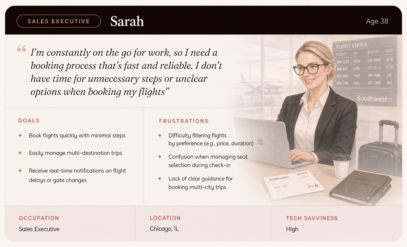
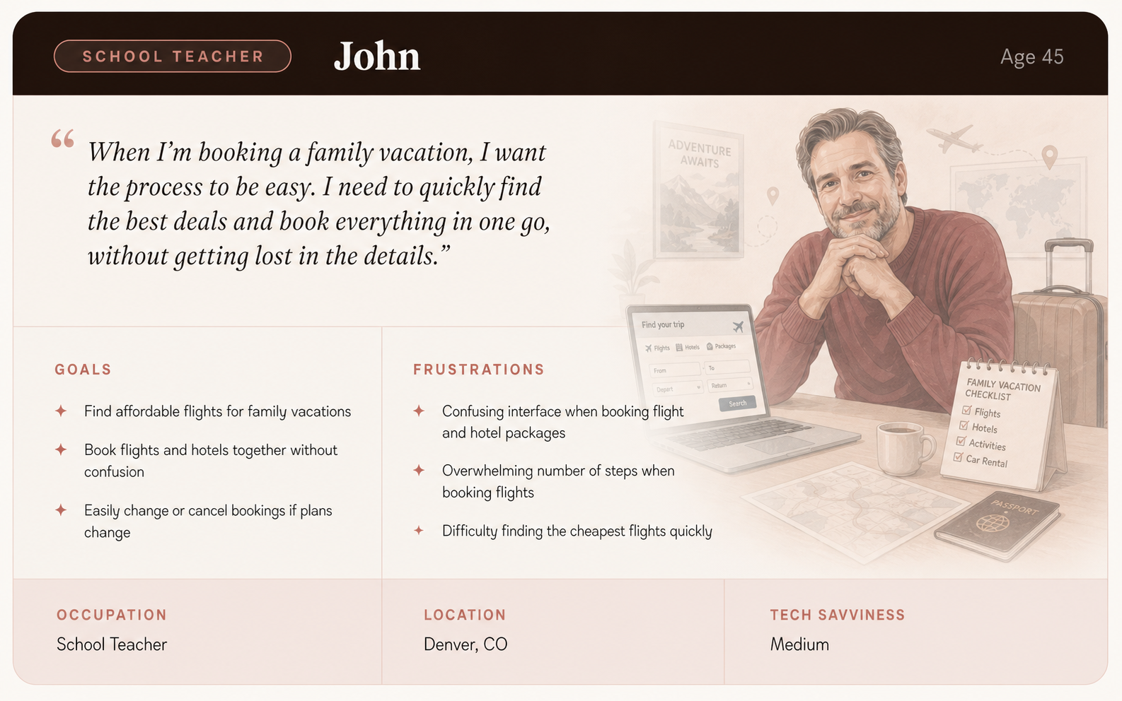
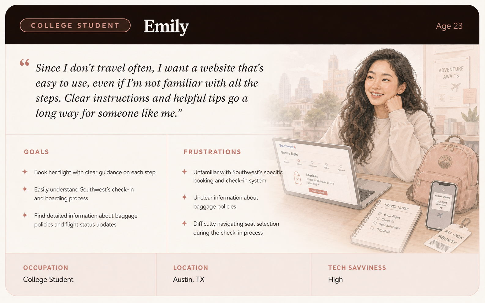
Three personas, drawn from real flyer behaviors, spanning expert to first-timer and business to leisure:
Then we built tasks straight from what mattered.
Each task mapped to a survey priority, so we were testing real behavior, not invented ones:
- Task 1 · Cheapest holiday flight. Because price was the 95% answer.
- Task 2 · Flight plus hotel for the family. Because bundling should be easy and nobody knew if it was.
- Task 3 · Multi-city business trip. Because departure time was the 81% answer, and multi-city is where it gets hard.
How we tested: 5 participants, moderated, remote over Zoom. Think-aloud throughout. We measured time to complete, number of clicks, and ease of use, with pre-test, post-task, and post-test questions around each one.
And we checked Southwest against its rivals.
We benchmarked the site against Delta and Expedia across six booking features. The pattern was clear:
We watched five people try to do three normal things. The same frustrations came up again and again.
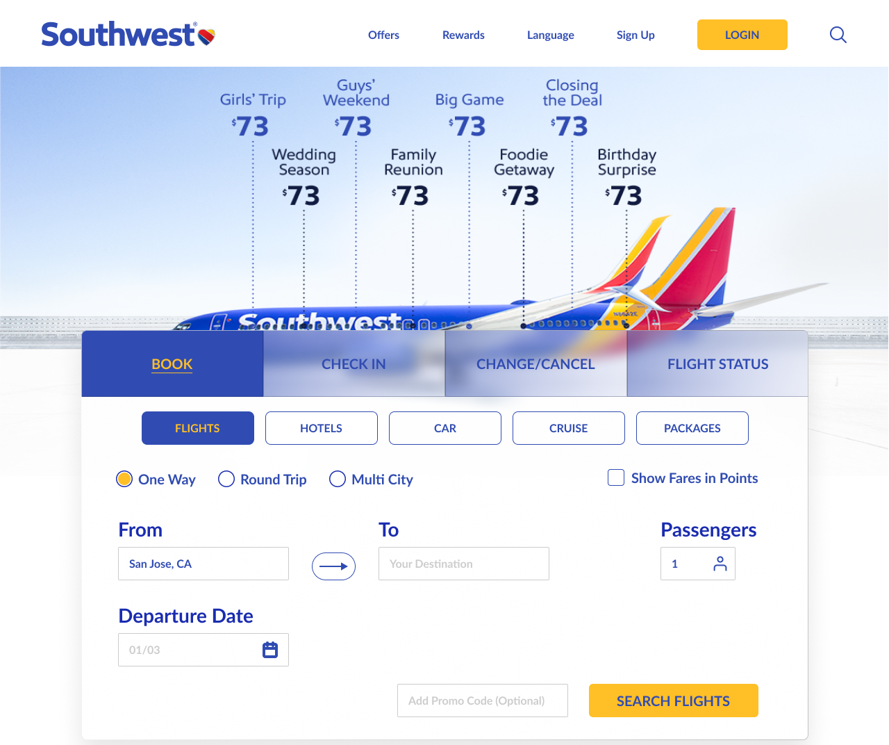
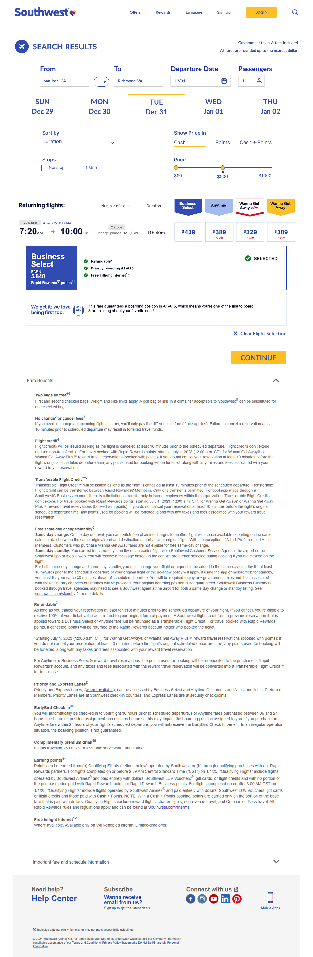
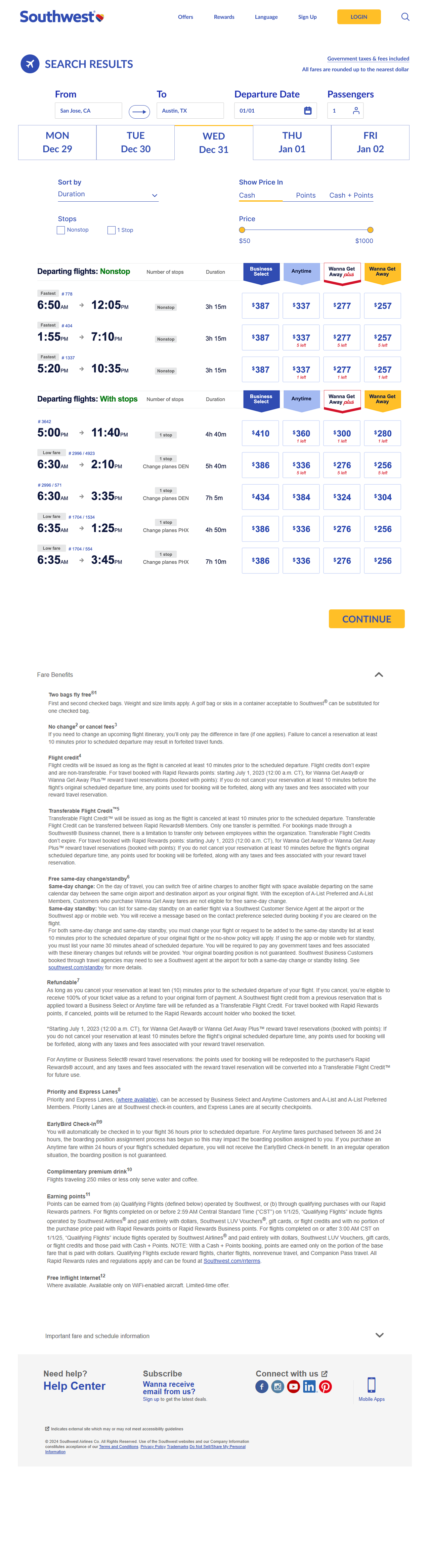
The "Sort By" filter sat between the calendar and the flight list. Technically visible. Functionally invisible. They only learned the filter existed when we asked about their frustrations afterward. The one thing 95% came for, and the tool to find it went unseen. Textbook inattentional blindness.
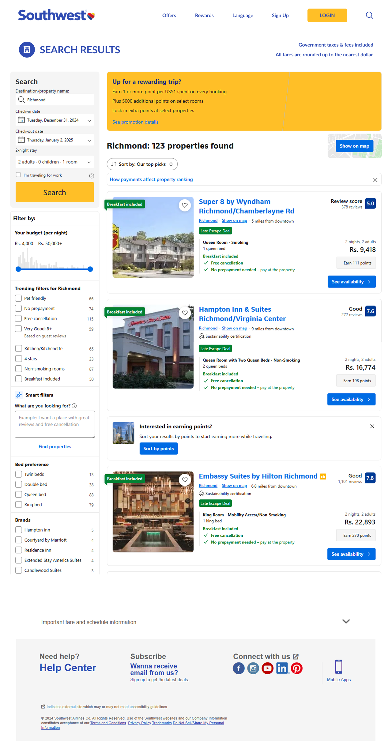
There was no hotel step inside the booking flow. So people booked their flight, then went back to the homepage to start a separate hunt. Only one person found the in-flow hotel option. A recognition-over-recall problem: the feature existed, but nobody remembered where.
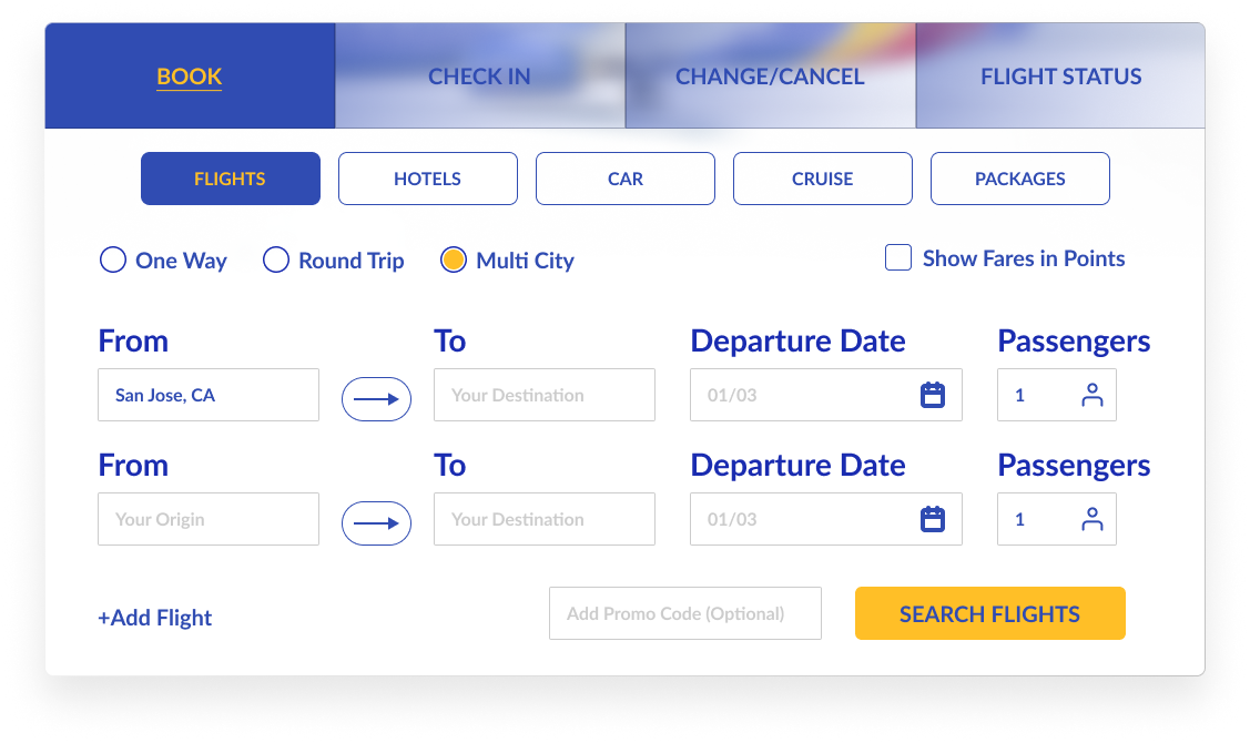
You couldn't reach multi-city from the homepage. It only appeared after you'd booked a first flight, and even then it let you add exactly one city. A hidden affordance. People can't use what they can't see, and the busiest task became the slowest.
And the tell that tied it all together.
Time and clicks nearly tripled from the simplest task to the hardest. The site got exponentially harder exactly where people needed it to hold up.
Oh, and 3 of 5 people accidentally bought a rental car along the way. Nobody meant to.Read the Full Usability Test Report →
Three problems. Three fixes. We prototyped in low fidelity first, tested the thinking, then built it out in Figma.
Fix 1 — Make filtering impossible to miss.
We pulled sorting out of the dead zone and gave it real presence: a clear Sort By control, stop filters for nonstop or one-stop, and a price slider, so narrowing by what matters is right there instead of buried.
Fix 2 — Put hotels inside the journey.
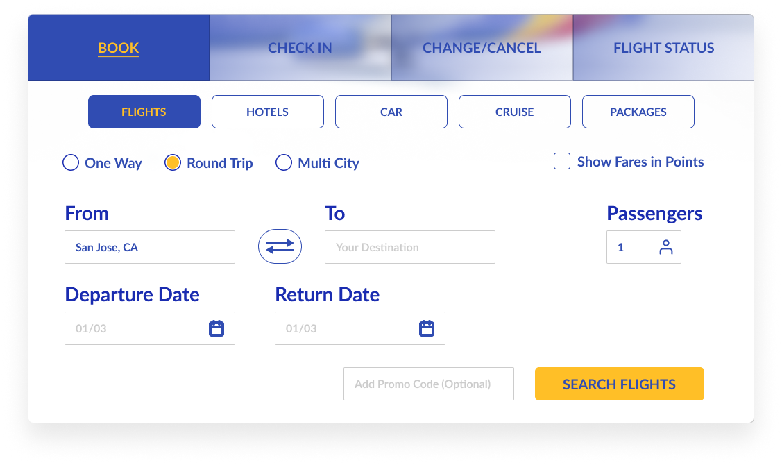
We folded hotel booking into the flow and surfaced it as a package, so it shows up where people already expect it instead of sending them back to square one. The hotel lands at checkout, not in a separate hunt.
Fix 3 — Bring multi-city to the front.
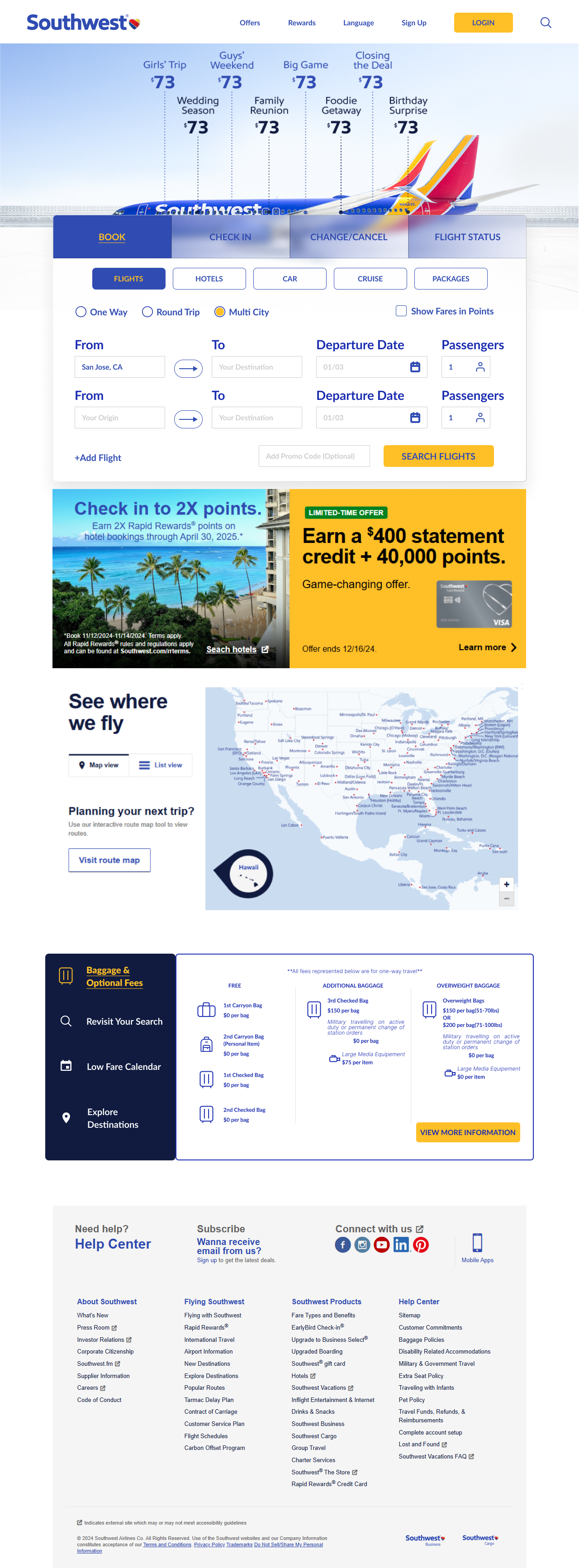
Multi-city moved up to the homepage, right alongside One Way and Round Trip. Add as many cities as the trip needs, with a clear visual of every flight selected so far.
One more thing we rethought: the homepage itself.
We rebuilt it so all three booking types are visible from the first screen, and the packages Southwest already offers actually get showcased instead of buried.


A redesign that looks better isn't a redesign that works better. So we tested it the same way we tested the original.
Same three tasks, same think-aloud, same metrics, this time with 4 participants on the new design.
The win we cared about most.
And the features people used to miss, they found.
This is the part a prototype can't fake. In the original, people walked right past the filter and never reached multi-city. In the redesign, they saw the sorting, recognized the multi-city option, and reached the hotel at checkout without backtracking. The hidden features stopped being hidden.
Time and clicks moved too.
Both trended down across the redesign, supporting what we saw: less hunting, less backtracking, less effort.
One honest caveat. The hi-fi prototype wasn't a perfect mirror of a live site. Flight destinations were pre-built, some buttons weren't interactive, and testers had just used the real Southwest, which primed them. So we read the time and click numbers as directional, not absolute. The ease score and the recognition wins are the ones the constraints couldn't manufacture, and those are the ones we lean on.
We didn't just redesign a booking flow. We closed the gap between what people wanted and what the site let them do, and we were honest about exactly how far the evidence goes.
Team poster · ISE 217 · Human-Computer Interaction · Click to enlarge ↗
Visible isn't the same as findable.
The filter was right there. People still couldn't find it. Inattentional blindness and hidden affordances are the difference between a feature that helps and one that may as well not exist. I design for what people actually notice, not what's technically on screen.
Behavior reveals the mental model.
Four of five booked a flight, then went looking for a hotel. That pattern told us where people expected the feature to be, more clearly than any survey answer. I evaluate by watching what people do, not just what they say.
A redesign isn't done until you've measured it, honestly.
Shipping something prettier is easy. Proving it's better means re-testing, and reading the results with a clear eye — including what the prototype couldn't fairly measure. Knowing what your evidence can and can't claim is the job.