
RockX is what happens when Silicon Valley money meets a midlife rock obsession: a museum, digital archive, and event center in downtown San Jose, built to keep rock and roll alive.
Visitors plan custom tours on the website, then follow them through the galleries with an AR mobile guide.
That's the part everyone sees.
Backstage, every single day:
- Events get scheduled, approved, and sold
- Guitars get loaned to performers and tracked back in
- AR sensors die mid-tour and need fixing
- Exhibits get curated, content ships on deadline
And one rule baked into the museum's founding: every dollar RockX takes from its endowment must be matched by ticket revenue before it's released. Someone is watching that math daily.
Meet Aisha, Digital Experience Manager. Museum studies background, systems thinker, zero patience for tools that slow her down. My job was to design the tool she opens every morning: the dashboard where she runs events, exhibits, the guitar collection, members, analytics, and content.
Every show needs a control room. This is RockX's.
Design the B2E web dashboard for RockX: the tool the museum's staff uses to run everything the visitors never see.
Sounds like a standard admin panel. It wasn't, for three reasons:
Most dashboards track numbers. This one tracks physical things that move and break: guitars out on loan, sensor batteries dying mid-exhibit, instruments due for maintenance. The interface had to treat the museum itself as live data.
On the B2C side, visitors build custom tour plans before they arrive. Every plan is a vote. Which exhibits make it into plans, which plans actually get completed: that behavior is the museum's best evidence for what's earning its floor space. The dashboard had to turn visitor planning data into curation decisions.
Aisha opens this dashboard every morning. No onboarding, no hand-holding, no decoration. Enterprise tools are judged by how fast an expert moves through them, which flips most consumer design instincts on their head.
Brief constraints: medium fidelity, max 3-column grid, 3 colors, strict type hierarchy. No polish to hide behind. Structure had to carry the design.
Structure first. Screens last.
Before drawing a single screen, I defined the grammar of the system: the objects Aisha manages, the actions she takes on them, and which combinations actually matter. For a six-section admin dashboard, this wasn't academic. It was the only thing standing between me and an interface that collapses into menus.
The grammar, fast
I started broad: every noun in RockX's world crossed with every verb. Then I cut it down to what the B2E dashboard actually owns: six objects, six actions, one matrix.
| Object ↓ · Action → | View | Add | Edit | Delete | Filter | Publish |
|---|---|---|---|---|---|---|
| Dashboard | ✦ | — | — | — | — | — |
| Events | ✦ | ✦ | ✦ | ✦ | ✦ | — |
| Exhibits | ✦ | ✦ | ✦ | ✦ | ✦ | — |
| Members | ✦ | — | — | ✦ | ✦ | — |
| Analytics | ✦ | — | — | — | ✦ | — |
| Content | ✦ | ✦ | ✦ | ✦ | ✦ | ✦ |
✦The grammar of the control room: six objects, six actions.
Each object then got its attributes mapped: what fields define an event, a guitar, a member, a post. This is the unglamorous spreadsheet work that makes every later screen almost design itself.
Prioritization: not all actions are equal
The matrix tells you what exists. It doesn't tell you what to optimize for. So every object-action pair got sorted by frequency: what Aisha does daily, weekly, rarely. Reviewing tasks and approvals, daily. Adding events and publishing content, weekly. Deleting an exhibit, almost never.
That sorting made the hard layout calls for me. Frequent tasks earned dashboard real estate. Rare tasks could live two clicks deep without guilt.
✦Frequency decides hierarchy. The dashboard front page belongs to daily work.
Three ways to say the same sentence
Here's where it got interesting. The same grammar can be articulated in navigation three completely different ways, so I sketched all three:
Go to the thing, then act on it.
Objects and hot actions share the nav.
Pick the verb first, then what to apply it to.
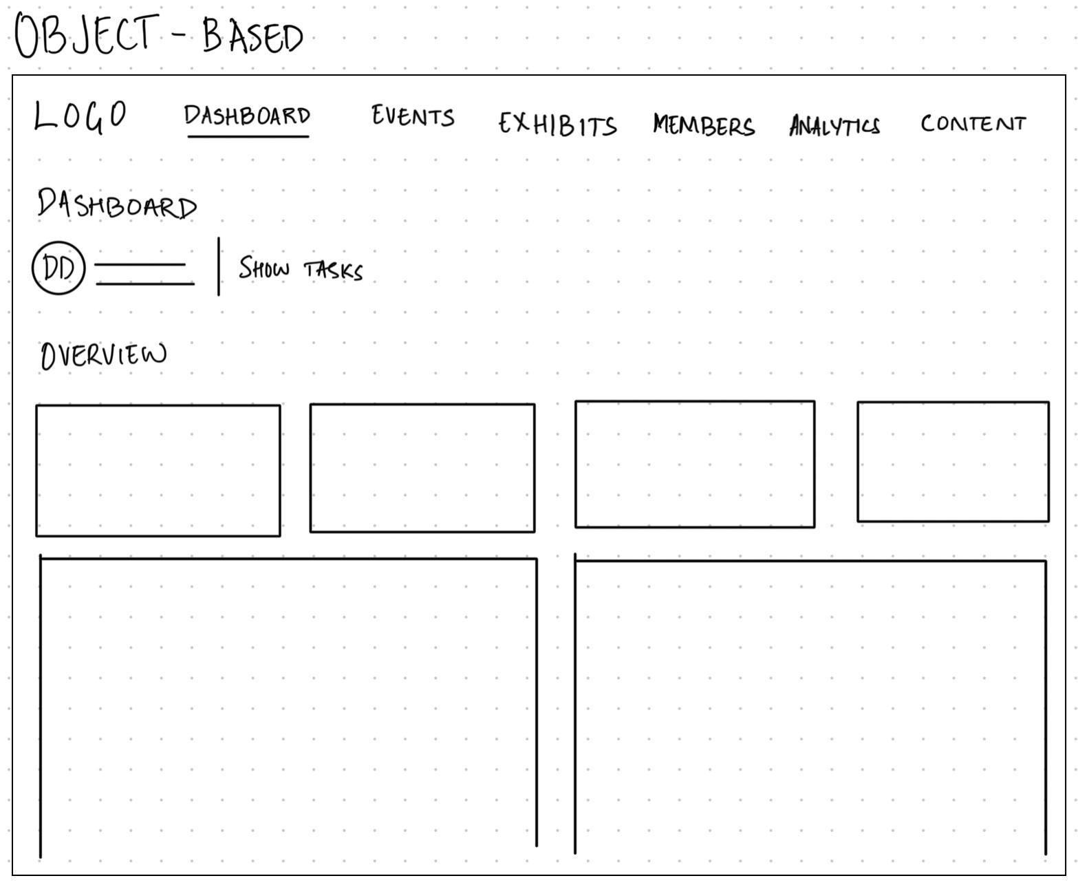
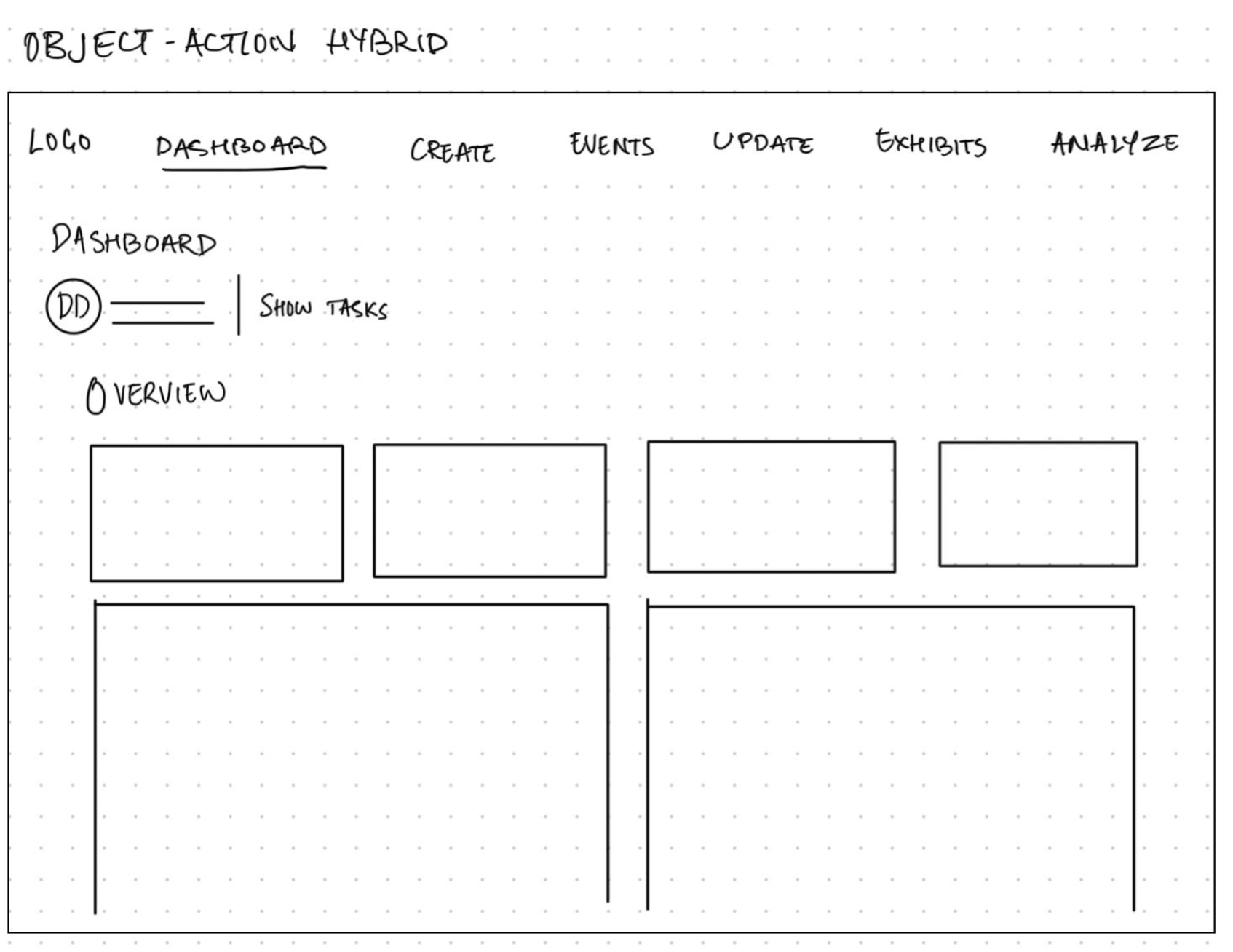
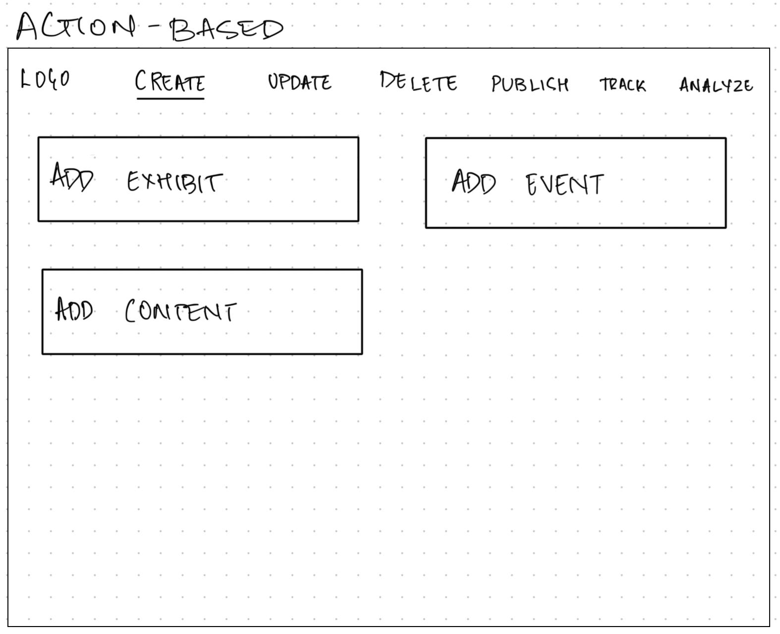
✦Same grammar, three articulations. Only one survives contact with a daily user.
Object-Based won, and the reason is Aisha. She doesn't start her morning thinking "I want to create something." She thinks "what's happening with this weekend's events," "where are my guitars," "did that content go out." Experts navigate by the thing they're responsible for. Action-first nav forces a second decision on every single trip, and the hybrid makes her learn two systems at once. Object-based meant the navbar IS the matrix's top row. The grammar became the interface.
From grammar to motion
With the structure locked, I mapped the experience flows for the core workflows, like managing exhibits: dashboard in, bands or guitars, create-edit-archive branches, confirm, out.
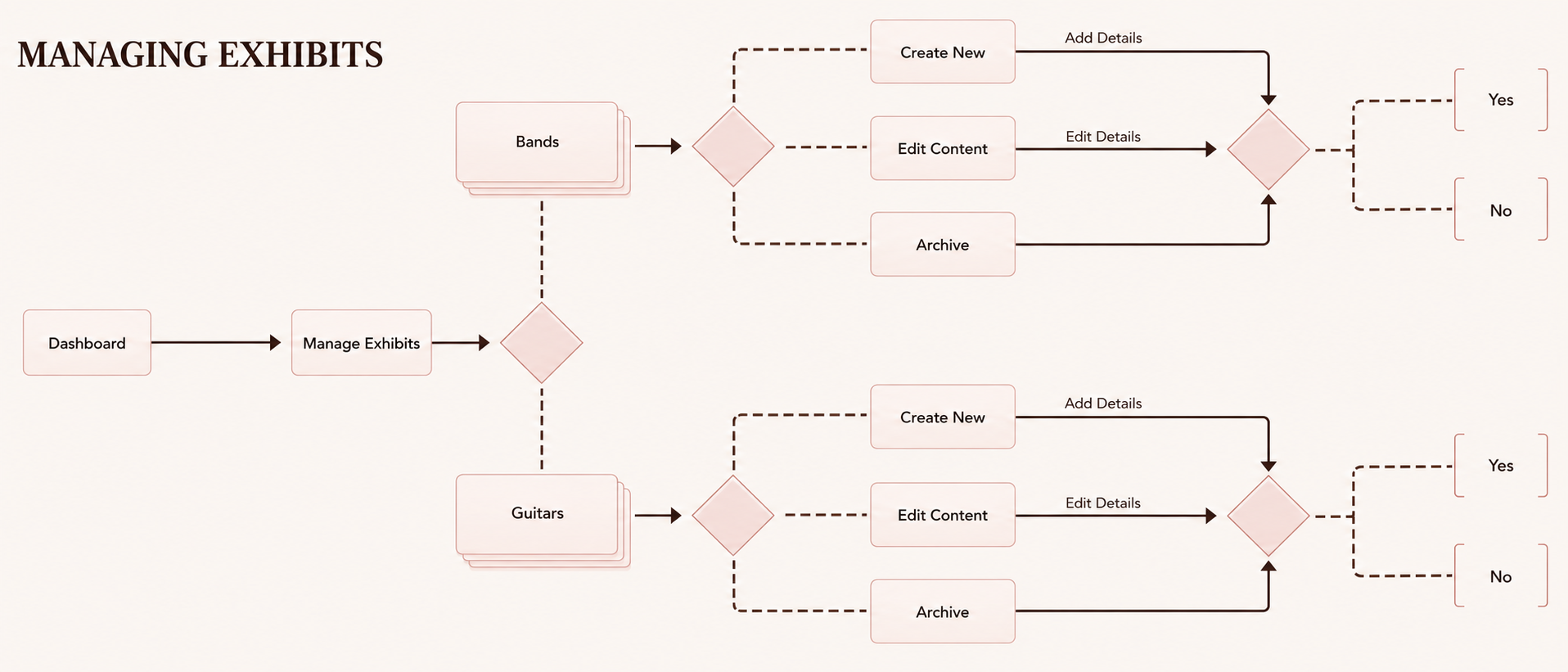
✦Managing exhibits, mapped before any screen existed.
Only then did screens happen.
A walk through the control room, the way Aisha actually uses it.
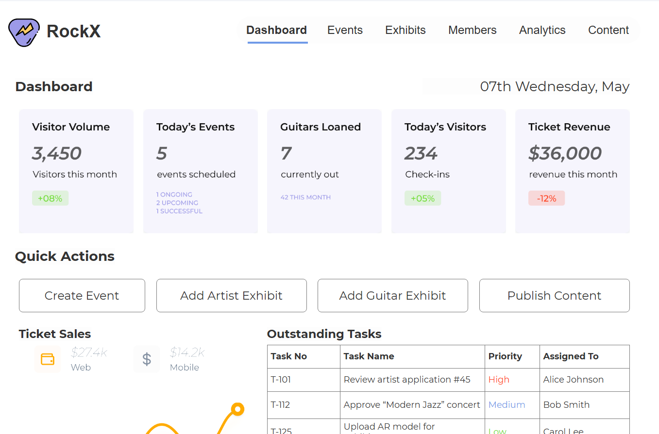
The morning glance
One question: what needs me today?
- 5 KPI cards · visitors, events, guitars out, check-ins, revenue + trend
- Work surface below · tasks with owners, sensor alerts, approvals, notifications
- Approve/deny in the row · frequent action, zero navigation
✦Pulse on top, work below.
Aisha isn't reading "Ticket Revenue." She's reading $36,000, down 12%. After a thousand mornings, labels are furniture. The data gets the weight.
Daily task → front page. No detours.
Creating an event
Long forms are where admin tools go to die. So: 5-step wizard.
- One decision context per step
- Save Draft at every point
- Steps mirror how staff think an event into existence
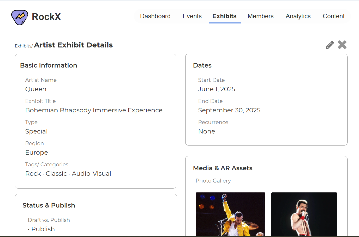
Managing the collection
Two tabs: Artist/Band exhibits and Guitars.
The guitars table is part museum, part lending library:
- Condition · location · assigned curator
- AR sensor health · next maintenance date
- Loan status · who has it · when it's due back
A dying sensor battery isn't an IT ticket. It's a broken visitor experience. So sensor health lives in the same row as curatorial info, because for Aisha it's the same job.
Reading the signals
The Analytics page is where the B2C side reports back.
- Visit plans created · completion rate · AR engagements
- Top Exhibits by Plan Inclusion · what visitors actually plan to see
- Conversion table · do plans become visits?
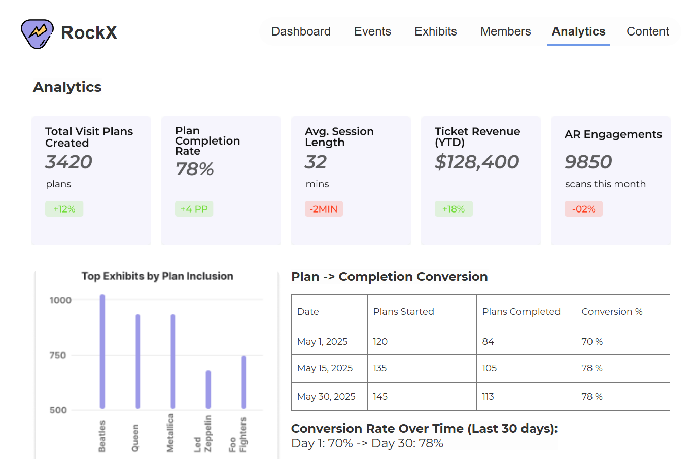
✦Every plan is a vote. This is where they get counted.
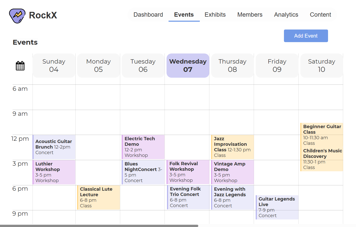
The rest of the control room

weekly calendar, color-coded
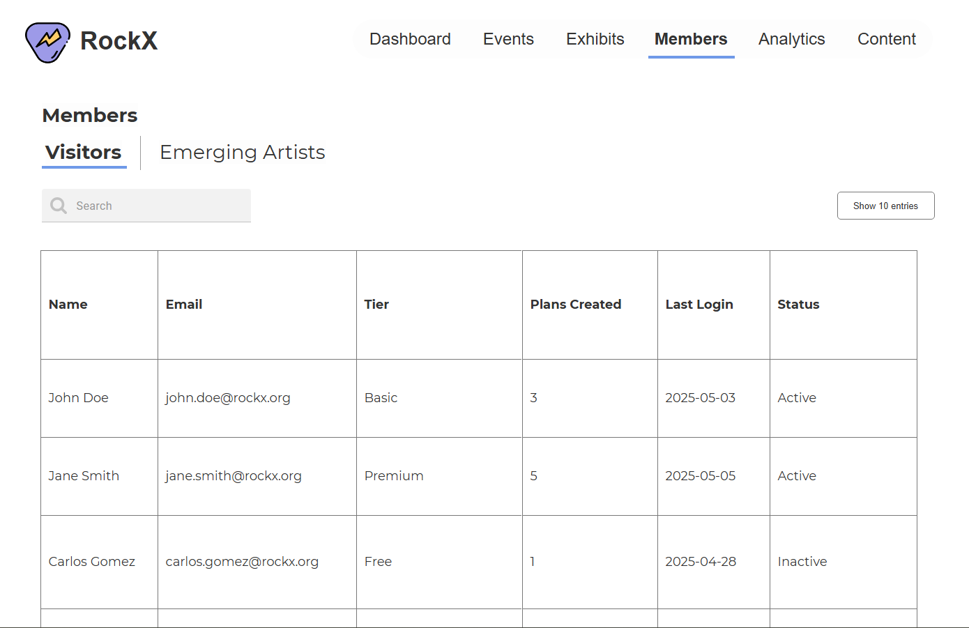
visitor tiers + emerging artist applications
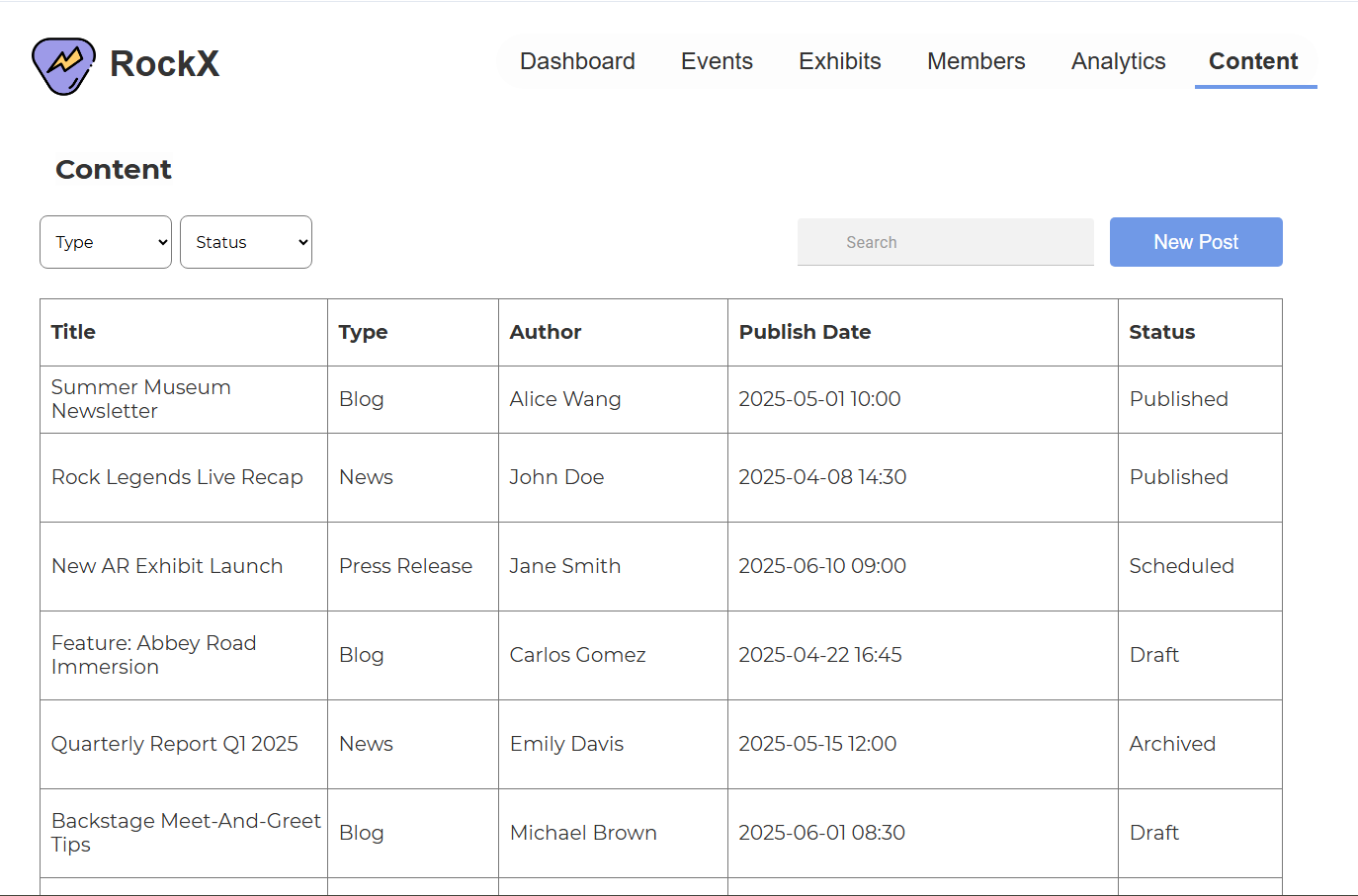
drafts → scheduled → published → archived
Every chart on this dashboard had to earn its spot. Here's the logic.
The rule I held myself to: the visualization matches the question, not the other way around. Aisha doesn't look at charts to admire them. She looks to compare, spot, and decide.
| The question | The viz | Why this form |
|---|---|---|
| Which exhibits are visitors planning to see most? | Bar chart, ranked | Comparison across categories. Bars make rank instantly readable |
| Is revenue trending up or down? | Line chart over months | Change over time is a line's whole job |
| Are visit plans converting into completed visits? | Compact table with % | Three dates, three numbers. A chart would be decoration |
| When is the museum actually busy? | Calendar heatmap | Density across days needs a calendar shape, not an axis |
| What's the pulse right now? | KPI cards + trend chips | One number, one direction. Glanceable in under a second |
Every KPI card carries a trend chip: +8%, −12%. A number without context is trivia. Aisha needs to know if it's a good number.
Half this dashboard is tables, on purpose. When experts need to scan, sort, and act row by row, a table beats a chart every time. Knowing when not to chart is the DV decision nobody talks about.
The grammar travels.
MatchDog was where the structure-first method clicked for me. RockX was the stress test: same process, opposite problem. Consumer app to enterprise dashboard, adopters to employees, emotion to operations. The objects changed, the actions changed, the method held. When the grammar is right, the navbar writes itself.
Experts read values, not labels.
Aisha lives in this dashboard. She knows where every heading sits, so the visual weight belongs to the data, not the labels around it. Designing for the thousandth visit instead of the first is the real difference between consumer and enterprise UX.
The business model is a design input.
RockX's founding rule, endowment dollars only release when ticket revenue matches them, is why revenue sits on the dashboard home with a trend chip instead of inside a monthly report. Some layout decisions come from finance documents, not user interviews. Read the business model before you place the pixels.