
A B2B ticketing startup. Real clients. Actual deadlines.
TicketsQue is a B2B digital ticketing startup building solutions for event management — digital coupons, ticket sales, and loyalty programs for pubs, venues, and event organizers. Small team, fast pace, real clients waiting on the other end.
I joined as a UI/UX Design Intern with a Computer Science degree and a Google UX certificate. No master's degree yet. No years of industry experience. Just eagerness and a Figma account.
Here's what they handed me: two separate design problems, a PM, a design lead, and a deadline.
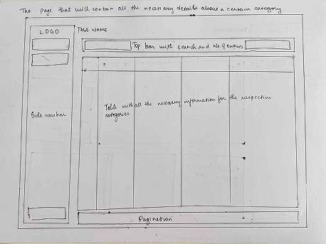
Dashboard
Module
Projects
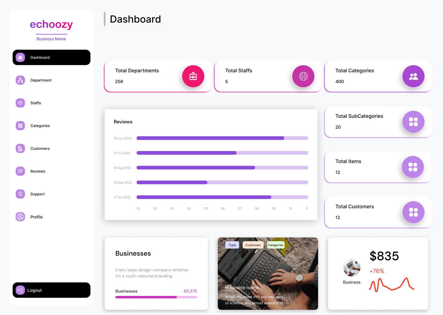
The problem wasn't a missing dashboard. It was a dashboard built for no one in particular.
Echoozy is a co-working space company that needed a dashboard to help their internal team manage operations: track available workspaces, handle bookings, onboard new clients, monitor usage, and support sales — all in one place.
The problem wasn't that they had no dashboard. The problem was that the one they had wasn't built around the people who had to use it every day.
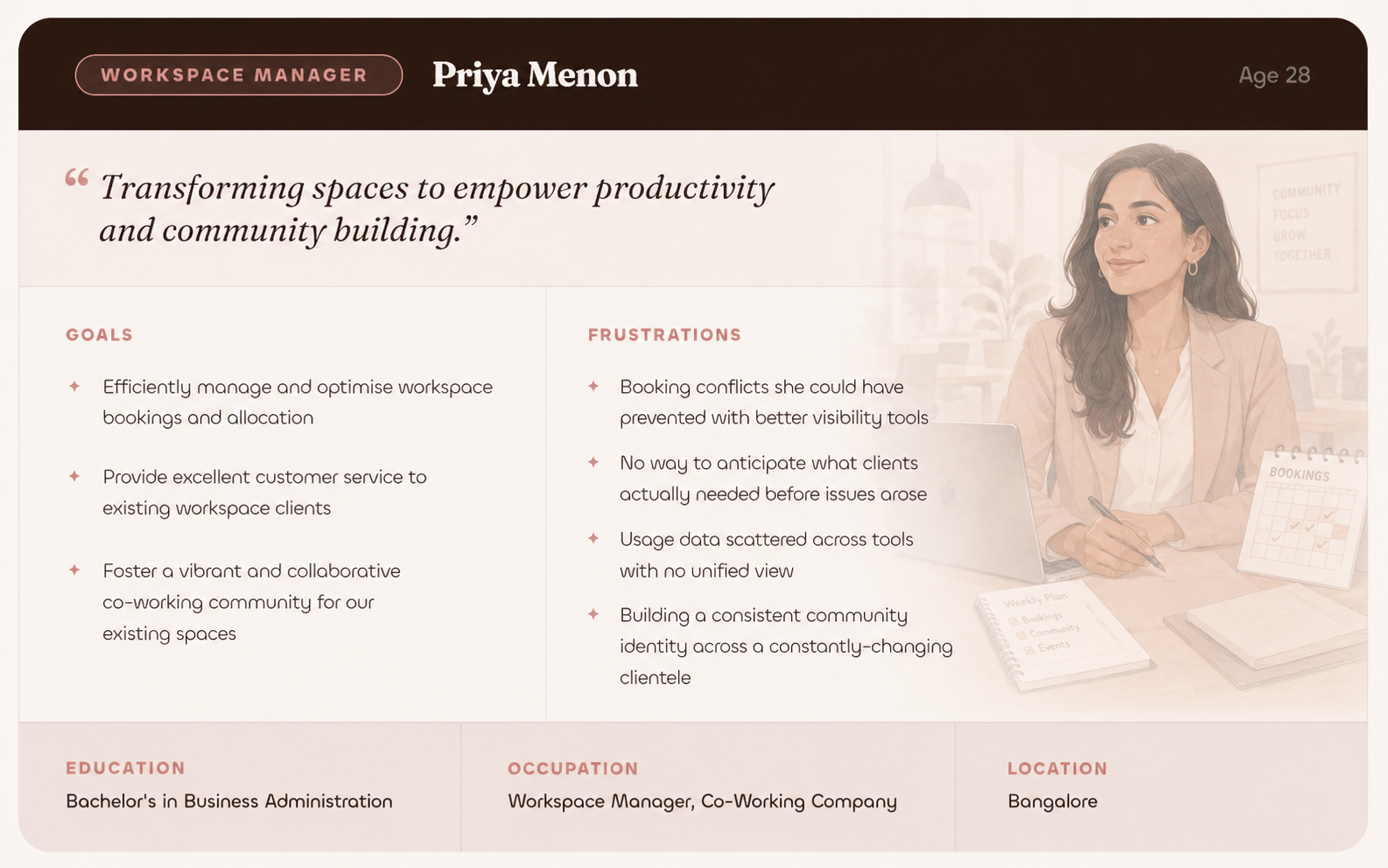
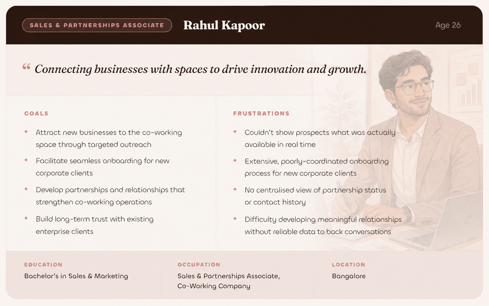
Two very different people, actually.
Meet the Users
What They Both Had in Common
Four pain points that kept surfacing — no matter which person you talked to.
Paper first. Working out what Priya needs to see first, what Rahul needs to access quickly.
Before opening Figma, I sketched. The goal was to understand how two very different mental models could share an interface without either person feeling like it wasn't built for them.
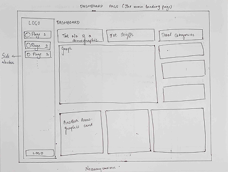
Then Digital Wireframes
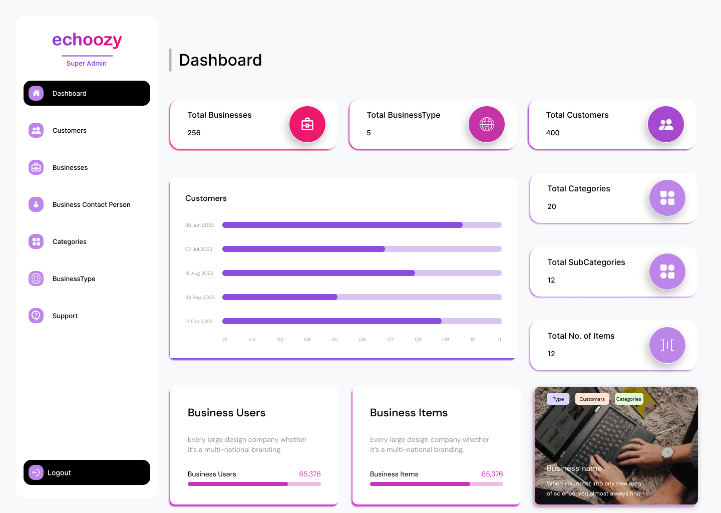
The wireframes focused on three things: a main landing dashboard with key stats visible at a glance, a persistent top search bar, and detail views for drilling into any category. Clean. Scannable. No hunting.
All key statistics on one screen. No clicking around to understand what's going on.
All tracked category information, structured and scannable. No digging through sub-menus to find context.
Search + number of entries, always visible. The tools that both users reach for most go at the top.
Because real data is never 5 rows. The interface needed to scale gracefully to hundreds of entries.
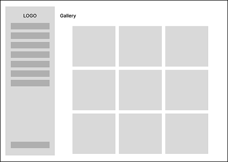
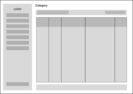
Client profiles with all the details the team needs, plus a gallery view for workspace context.
Mapping the Information Architecture
Early in the process, building out the full IA made something obvious: Priya and Rahul don't just have different goals — they need access to completely different parts of the system.
A comprehensive look at the total numbers and an overview
Customer Details
Provides details about the businesses; super admin can add new businesses
Provides details about the contact person of each business
Provides details about the categories; super admin can add new categories
Provides details about the business type; super admin can add new business types
Provides details about the support for each business; super admin can add new support
A comprehensive look at the total numbers and an overview
Provides details about the department; admin can add new departments
Provides details about the staff; admin can add new staff members
Provides details about the categories; admin can add new categories
Provides details about the customers
Provides details about the reviews
Provides details about the support
Same entry point. Completely different scope. So we built two.
Trying to force both roles into one view would have meant either overwhelming Priya with controls she didn't need, or restricting Rahul from data that was critical to his job. The IA made it clear: these aren't two people using the same tool differently. They're two people with fundamentally different access requirements.
Day-to-day operations. The view is built around what Priya needs to keep the space running without friction.

Broader system access. The view is built around what Rahul needs to sell the space and manage enterprise relationships.
Two rounds. Real users. Real feedback.
Designs don't get better in isolation. After the initial builds, we tested with real users, watched where they got stuck, and went back and fixed it.
Round 1 — What We Found
New admins were getting lost between sections. The structure made sense to us; it didn't make sense to them.
The Super Admin Dashboard had too much going on at once. Finding specific things took too long and felt overwhelming at first glance.
Adding new staff members during onboarding was confusing. First-time users needed clearer direction about what came next.
Round 2 — What Changed
- Navigation felt significantly more intuitive. Users moved through sections without hesitation.
- The Super Admin Dashboard felt manageable with the reorganized feature layout. No more "where is that thing?"
- New users moved through staff onboarding without getting stuck. The added tooltips and step guidance did their job.
If Echoozy was about making a complex tool usable, this was about making a business case irresistible.
TicketsQue was expanding their product — a VIP membership program that pub owners could offer to their most loyal customers. Think exclusive perks, digital membership cards, loyalty rewards. Great idea. But pub owners needed to understand why it was worth adopting before they'd ever click "Book a Demo."
That's where I came in. I designed the page — and wrote the content for it.
The Problem
Pubs and venues were already managing a lot. Convincing them to add another tool to their stack meant the value proposition had to be immediate and undeniable. The page needed to answer three questions in under 30 seconds:
What is this? The value proposition in plain language, before any scrolling.
Why does my pub need it? Business benefits tied directly to what a pub owner actually cares about — retention, revenue, repeat visits.
How does it actually work? A clear process flow, not a wall of feature specs.
What I Designed
Working with the design lead and PM through multiple rounds of iteration, the page came together around a clear hierarchy.
Big and direct. A visual that showed the product ecosystem at a glance, before any explanation.
Customer Retention, Increased Revenue, Data Insights, Marketing Opportunities, Brand Loyalty, Community Building — each stated simply, each tied back to what a pub owner actually cares about.
Distribute memberships → add offers and benefits → members enjoy benefits → business grows. Four steps. No jargon.
A diagram showing what VIP cards could actually be used for: loyalty points, special discounts, complimentary items, early access. Show it, don't just list it.
What is this program, how does it work, what are the benefits, can businesses customise it. Objections answered before the sales call.
One clear next step. "Create Event." No ambiguity about what happens when you click.
The Iteration Reality
The design went through multiple rounds of review with the design lead and PM before it was signed off. Each session tightened the hierarchy, refined the content, and pushed the visual language toward something cleaner and more confident. Startup feedback loops are fast and direct — you present, you listen, you go back and fix it. That's exactly what this was.
Startups don't do one thing at a time.
Alongside the two shipped products, I also worked on training projects — each one teaching me something specific about how production-ready design gets built.
Redesigned the marketing website with a focus on simplifying the demo booking journey and communicating the product's value more clearly.
How to translate a value proposition into a user journey.
Designed the mobile UI for a ticket sales app — onboarding, event browsing, booking flow, e-tickets.
An internal tool for restaurant concierges to assign tables to customers. Simple problem, surprisingly interesting to design — the people using it are on their feet, moving fast, and can't afford confusion.
The difference between designing for a task and designing for a moment.
Efficiency isn't just about fewer clicks. It's about the right information in the right place at the right time.
I walked into TicketsQue thinking internships were about learning how to design. I walked out having learned something more specific.
How to design in conditions that are not ideal, with timelines that are not comfortable, for clients who are real and waiting. Three things that stuck:
At a startup, "we don't have time for another round of research" is sometimes genuinely true. Learning to make good decisions quickly — with the information you have, not the information you wish you had — is a real skill. I got reps in on it here.
The sessions with the design lead and PM were where the work got better. Not in my own head, not in Figma alone — in the conversation. I initiated those sessions. I'd do it again every time.
A design is never done. But at some point, it has to go live. The Echoozy dashboard and the VIP page both launched while I was still mentally tweaking them. That's fine. That's how it works. Done and shipped beats perfect and waiting.